What should be capitalized in a videogame? This is the question I ask of every new project, no matter how simple the copy appears, because capitalization does not function the same way in games as it does in other writing contexts. Each game demands a different answer, and getting there is a journey that immediately launches me into the heart of the game’s relationship to its text. When the answer is finally settled, I’ll know a lot about the game without having ever run its .exe. In this article I will explore why that is— and what it might mean for your game.
Why Do We Capitalize Anything?
Capitalization in Standard English has two fairly straightforward roles: To mark the boundary between one sentence and the next and to mark a distinction between proper nouns and common ones. Capitalization is primarily a means of giving visual structure to a text. We use capital letters to mark these features of our sentences simply because capital letters look different from lowercase ones; they draw the reader’s eye towards them and jump out from among the field of lowercase letters.
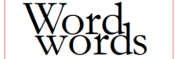
The start-of-sentence cap doesn’t say anything about the content of the word, but capital letters found elsewhere in a sentence do. The capital letter at the front of a proper noun signals the word’s distinct status: This word is not like other words. This word is unique, specific, a bespoke thing; it is a name. In this second function, capitalization carries information about the content of the word itself— the capital letter carries meaning. This is especially important when the proper noun would otherwise look identical to a common noun; capital letters let you know instantly whether I’m talking about apples or Apples.

Understanding Ludic and Diegetic Elements
How does the unique medium of videogames complicate this simple function? Consider this scenario. In the game Card Quest, players can equip the Paladin School of fighting, which gives the player access to certain abilities that are thematically tied to the fantasy archetype of the Paladin. The description of this school talks about faith twice, and we can assume that in the fictional world of the game the paladin is always resolute in his faith. Of course he is; that’s what makes him the paladin.
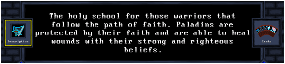
But the paladin can run out of Faith— mechanically speaking— because this word also refers to a game system wherein Faith is a sort of battle currency that the player can build up and then spend to apply or avoid damage. “This is not a pipe”; sometimes, faith is not Faith— or perhaps more clearly: the paladin’s faith is not the player’s Faith. The Faith that the player interacts with has no existence in the fictional world of the game, and the faith that defines the paladin’s personal character has no bearing on the player’s game experience (except to whatever extent the player is participating in the fictional narrative with their imagination).
What does this mean? It means there has to be some way to differentiate between two objects or concepts which share the same signifier but have different meanings, to communicate to the player whether the word refers to a ludic element or a diegetic object. Let’s call these gamewords and worldwords, respectively. Well, we have a perfectly good device that can communicate the difference between otherwise identical signifiers, don’t we? Enter capitalization. And so it came to be that in many games, the names of interactable or obtainable items, objects, and abilities are styled with caps even when they in the middle of full sentences: Caps are an easy way to mark a difference between diegetic things of the simulated world and the elements of the abstract game system. It’s a natural and reasonable response to the need to communicate to players, “This word is not like other words. This is a ludic element.”
Capitalizing gamewords can be a good first instinct, and there are lots of cases where it’s the best option. Any high-level information display, such as a character sheet, or stats overview, or resource bar should almost certainly use caps, following basic UI standards. Most inventories should use caps for names of objects, though not necessarily when referencing the name of the item in body text. The ingredients of crafting recipes should be capitalized. Overall, marking up your gamewords by capitalizing them is not the worst approach and there are many games that can capitalize pretty much all words relating to the game’s mechanics and objects at the player’s disposal (such as abilities and inventory items) without running into problems. Most developers seem to have a pretty good sense of when capitalization might be helpful, and it’s a lot more common to over-use caps than under-use them. That’s why I will focus more on when and why you might want to pull back on caps instead.
The Case for Lowercase
The flip side of the natural and reasonable impulse to capitalize gamewords is that a deluge of capitalized words that are not normally capitalized in everyday writing can be fatiguing, unattractive, and jarring to players. They might begin to wonder why so many words are capitalized; player assessments of the game’s overall polish can take a hit. The clutter can get especially bad in games with a lot of complex systems.
Here is an example of a text field crowded by capitalized gameplay terms, or gamewords. The reader’s eye is drawn towards these keywords, but there are so many competing that the overall effect is chaotic, and it’s hard to get much information at a glance.
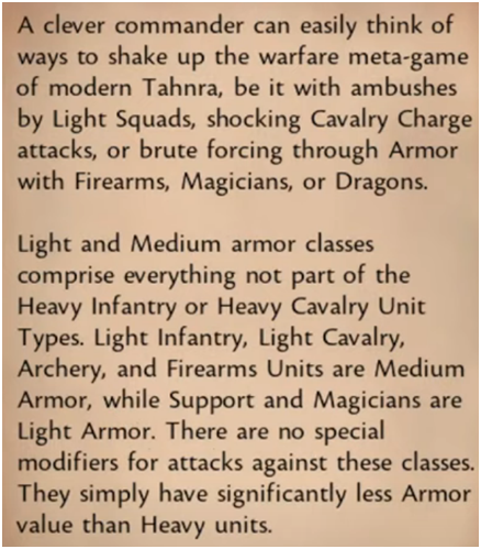
There are a few ways to reduce the amount of capitalized terms cluttering up the screen, and the first one is to make sure you’re not stuffing your game with terms that don’t actually mean anything. In the above example, it’s stated that the Light/Medium/Heavy armor classifications are only an index of the units’ armor values, not a distinct tag or characteristic that can be exploited in some way. Therefore, the most reasonable solution might be to just eliminate this set of terms, or at least demote them to regular words with regular, non-specific meanings: “xyz classes have light armor,” which simply means their armor value is low. Keyword-trimming like this is important to do before messing with the visual language of the game’s text, but it often won’t do the job by itself.
The feeling of disarray produced by excessive capital letters is magnified when capitalization is the only method employed to make the gamewords stand out, as is the case in this example. Supplementing capitalization with some other visual means of differentiation, such as bolded or differently colored typefaces, could lend structure to this image. This approach runs the risk of making the problem worse, trading one form of visual clutter for another, but if it’s done thoughtfully, this wider variety can be used to establish a well balanced visual hierarchy of game terms.
Slay the Spire: A visual hierarchy case study
Here’s an elegant visual hierarchy at work in my favorite card game, Slay the Spire.
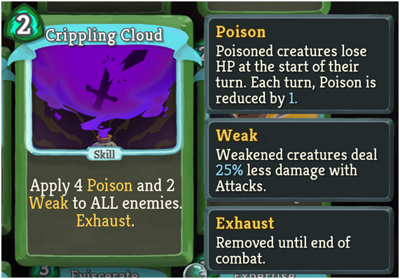
At the top level of the hierarchy…
…are keywords that relate to an individual combat encounter, styled with capital letters and yellow typeface. Block generated in a given turn, effects applied to enemies (debuffs) or the player character (buffs), and temporary effects on your deck, like the “Exhaust” mechanic all fall into this category. Each of these terms is helpfully defined in pop-out boxes, providing an easy reference for players while further reinforcing the term’s significance. This is the nitty-gritty that shapes how combat plays out, and the yellow color, capitalization, and pop-outs all work together to communicate that these are the core gamewords that represent what’s going on in the game.
The next level of the hierarchy…
…consists of keywords that refer to the player or their deck in a context that goes beyond a single combat encounter, and these are styled in simple caps. Unadorned capitalization communicates that tags like card types or card rarities as well as the player’s health (which doesn’t reset between encounters) are all technically gamewords, but they are mostly static compared to the top-level items. The rules around these keywords are much simpler and don’t require a lot of explanation, so they can be marked in a pretty subtle way, and have less need for pop-out definitions.
Finally…
…“ALL” is (probably) set in all-caps because it doesn’t really fit either of these categories but is a very important word for players to see. Sometimes these systems have to make one-off exceptions, but having an otherwise tight visual hierarchy leaves room in the design for these exceptions.
The Slay the Spire example also demonstrates the primary way to minimize the cap-clutter: simply choosing not to mark up certain gamewords at all. In the above cards, “card,” “draw,” and “enemies” are styled as normal running text without any special typography. An argument can be made that these are, in fact, gamewords, and many games do choose to capitalize even these most basic mechanical terms (see treatment of “Armor” and “Units” in previous example). But while these concepts are very much a part of the game— part of the ludic system— the words are used in familiar ways that generally reflect common usage, both in other games and in the dictionary. Because of the simplicity of their usage, these words don’t have to be marked out in order for them to carry their necessary meaning. This is probably the single biggest way to avoid an overly cluttered field of capital letters: simply letting some gamewords be words and trusting the rest of your game’s design to obviate any further visual distinction.
Tone Control
Even if a UI is not cluttered by most standards, the effect of haphazard capitalization can be very disruptive for games that maintain a very specific tone and atmosphere. In a very stylized and text-focused game, even a scant few capitalized gamewords scattered around the screen can disrupt the game’s overall tonal experience. Alan Wake, a game about a novelist whose horror story comes to life, trades heavily off of its atmosphere and precise, literary storytelling. Styling gamewords in simple lowercase helps maintain a consistent look and feel throughout the whole game experience that would otherwise be broken by a more standard approach to game typography.
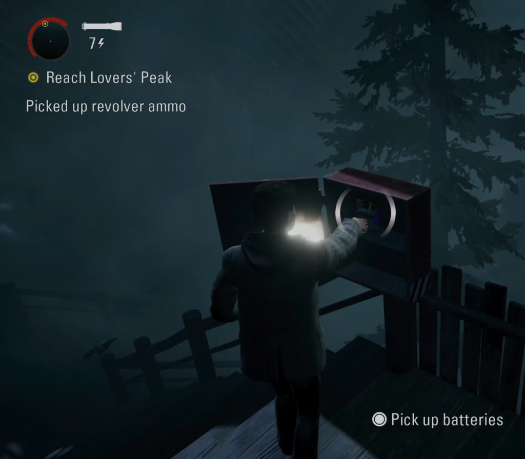
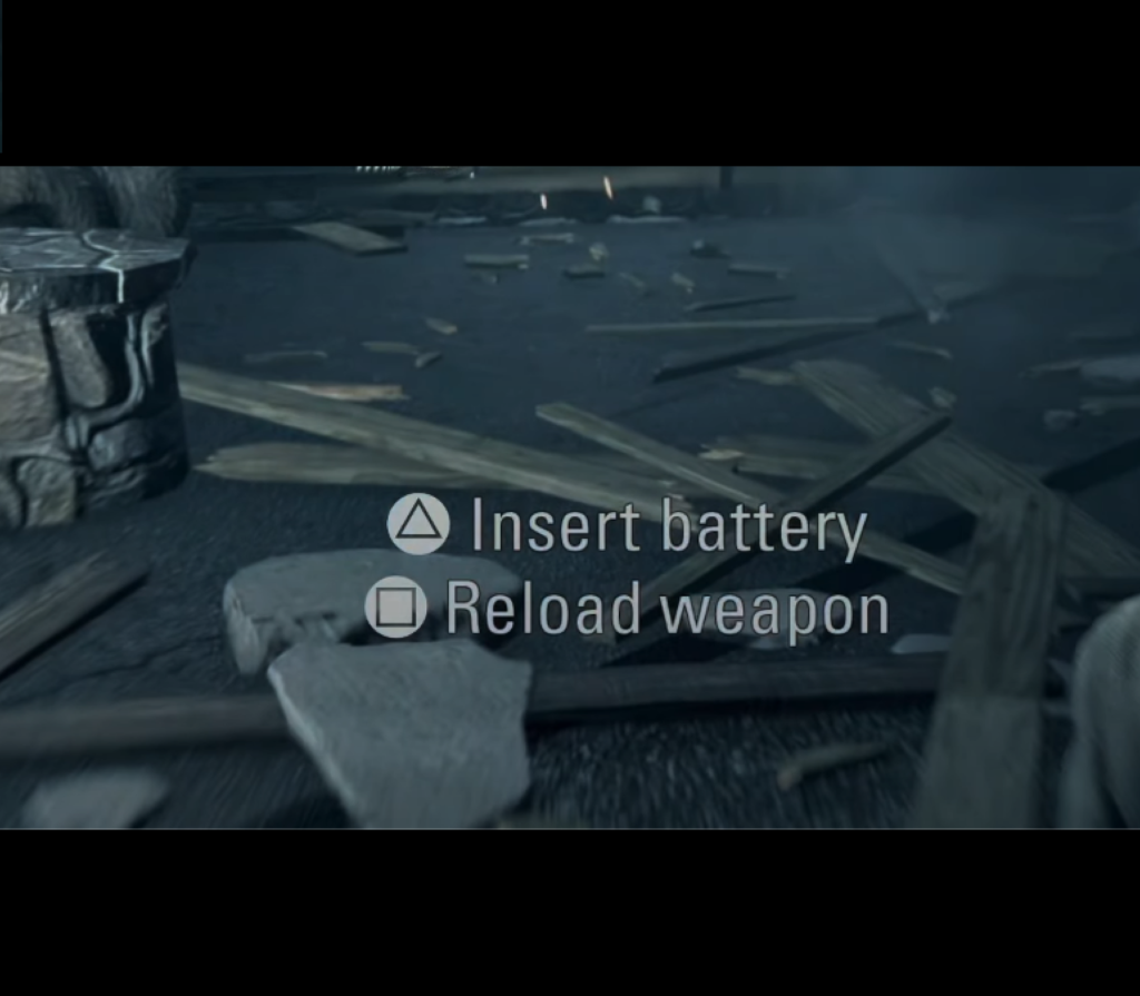
Alan Wake maintains a strong commitment to treating gamewords as common nouns, but the interface also makes extra affordances to ensure clarity isn’t lost to aesthetics. This is done in the UI through the use of clear, direct, simple prose in mission instructions and gamepad icons that show what key to press to pick up items.
Capitalizing gameplay-related words like ammo or batteries just might not fit with your game’s look and feel, and it’s important to know if this is the case. Observant readers may take note that the words in these examples are regular, real-world objects; if you’re writing games that take place in the real world or deal with real-world themes, it’s probably worth giving some thought to using spare capitalization to keep the text’s style grounded.
Blurring the Lines of Diegesis
A related but distinct goal that can be easily interrupted by capitalizing gamewords in every instance is the desire to bring the player’s experience closer to the player character’s experience. Capitalization strategies can be employed to create a smoother gradient between the unique player-objects—which don’t exist in the fictional world of the game— and the objects that the player’s character shares with everyone else in it—which functionally don’t exist within the game’s mechanics.
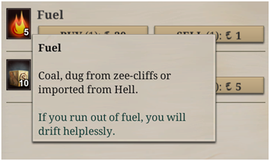
Sunless Sea, which might be described as an interactive short story anthology stretched out across a game map that you navigate via boat, achieves this blurred line by capitalizing objects in the inventory but leaving them lowercased elsewhere, like in dialogues and event narration. This helps create a more seamless connection between the player and the world; the player’s Fuel is really just fuel, as in, the stuff what makes the boat go forward, and the player’s ludic (gameplay) experience feels more closely analogous to the simulated world of the game.
To put it another way, the player is made to feel closer to their character who really exists in the game’s world, because the character doesn’t write “fuel” with a capital “F” (or have a little GUI with a resource bar at the top of their field of vision, or keep multiple backup save files, and so on). To the character, fuel is not a piece of game-mechanical terminology; it’s not a gameword. Sunless Sea’s compromise of capitalizing such items in contexts of direct ludic interaction (“You have 5 Fuel/You need 5 Fuel/This will consume 5 Fuel”) while leaving them lowercased elsewhere helps to pull the player experience in closer to the simulated world while still making sure gamewords are properly communicated when they really need to be.
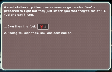
Spaceship simulator FTL: Faster Than Light achieves a similar goal, though counter-intuitively the game uses a nearly opposite process to do it. FTL primarily refers to gamewords with just a small handful of recognizable icons, creating a sort of meta-layer of information that floats above the diegetic world. But they don’t try to mix these worlds together seamlessly; instead, they give the relevant information twice; once in understated, worldword terms, and again in the form of icons, neatly and subtly contained in a small box next to the event options. Notice that in the prose of this roleplaying event, the icon doesn’t stand in for the word fuel, but instead supplements it, not unlike the gamepad icons in Alan Wake. Ensuring that the game element is properly marked in its own way allows “fuel,” a very gamey resource, to function as a diegetic item in event option 1, blending naturally into the event’s narration. The effect is that the decision to “Give them fuel” is read on the same level as “Apologize and wish them luck” so they are both experienced as diegetic actions that characters in the world are taking. But the player is never left uncertain of the gameplay effects of the decision: they’ll lose two units of ![]() .
.
Summary and Conclusions
There are three main reasons to consider a more restricted approach to capitalization in your game text:
- A text field full of capitalized words can be unattractive, jarring, and cluttered
- Capital letters scattered throughout your game’s interface can work against the aesthetic and tonal goals of your design
- The function of capital letters to sharply mark off game elements from game-world elements can create an unwanted split between the player and the game world
…And here are the most effective ways of reducing the amount of capital letters in your game:
- Employ a wider range of visual devices to differentiate words so that capitalization is not the only element of your visual hierarchy
- Rely on supplemental UI elements such as small icons to communicate game information so that the actual text of your game does not need to communicate this information in its styling
- Look for words that don’t need to be capitalized, colored, iconographed, or otherwise marked out. Let some of your gamewords simply be words.
- Bonus: Make sure your gamewords actually mean something distinct and specific to your game, and demote them to common nouns if they don’t.
Text in videogames simply functions differently from other forms of text, and it needs a different kind of editorial hand as a result. Many forms of published text have a set of standard rules that can easily be applied to a wide range of cases. These rules are often compiled in large manuals called style guides which are then adopted by entire industries, in order to enforce consistency not just across one publication but all publications working on the same subject matter or within the same discipline. However, it is hard to apply this model to videogames, and there is no universal approach that can make the text of every video game clear, consistent, and nice to look at; all games are a kind of linguistic assemblage all of their own, one that applies various conventions eclectically to best serve its singular goals.
The design choices around video game writing will, therefore, always need to account for the natural differences between the ludic and diegetic elements of the game. Capitalization can draw hard lines or muddy the waters, depending on the needs of the game. No matter the choice, capitalization should always be employed deliberately and consistently so that players can organically figure out whatever it might mean in your game and learn to read the unique assemblage of language you’ve presented them with.
I hope this has helped some people think about how to approach the question of capitalization in their game design, but if you don’t want to worry about all these details, you don’t have to. I can edit the text of your game to ensure that it’s smooth to read and free of errors, including coming up with a capitalization scheme that is logical, consistent, and fits your game’s unique tone and gameplay requirements. I’m available to edit anything from a 20-minute point-and-click adventure to a 30-hour CRPG. Use the contact form or simply drop me an email: [email protected].